Fiesta for the Mind
Fiesta for the Mind is my new example any time someone tries to claim "If it has to be accessible it has to be boring.”
Intro
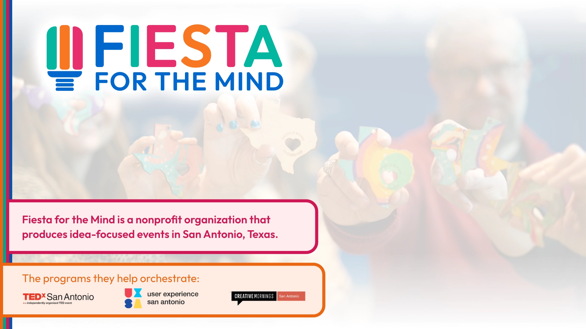
Fiesta for the Mind is a nonprofit organization that produces idea-focused events in San Antonio, Texas. They help orchestrate events for TEDx San Antonio, User Experience San Antonio, and Creative Mornings San Antonio.
This website build was facilitated by Knowbility's Accessibility Internet Rally (AIR), an annual competition to raise awareness for global web accessibility. During the competition, teams of web professionals collaborate with nonprofits, artists, and community organizations to build or improve accessible websites within an eight-week timeframe.
This project was quite unusual, as the team lost two members mid-project, including the lead developer. I was brought in to help finish the project in the final two weeks of the competition.
Goals
Primary goals for this website were to:
- Inform public about Fiesta For The Mind programing, history, and impact.
- Deliver a site that adds to Fiesta For The Mind’s credibility and brand recognition.
- Encourage users to get involved in the local events community through four key methods: Attending, Volunteering, Speaking, or Donating.
- Create an accessible, responsive, and easy to maintain website for this growing nonprofit.
Process
Without a full website of their own, the team was able to start from scratch with a fresh design and build. The team had already done a lot of work to define the brand and the goals of the site, so we were able to jump right into the design and development process.
Constraints
Everyone participating in the Knowbility AIR Competition was given 2 months, which is already a quite aggressive timeline. The team also unfortunately lost two members mid-project. Despite these setbacks, by the time I joined for the last two weeks of the competition we were able to rally together and deliver something we're all very proud of.
Sitemap Development
FFTM had excellent pre-work complete to map out their needs and dreams for a new site. We took their draft and built a simplified sitemap focused on enticing users to learn about their programs and support them through donations.

Colors & Typography
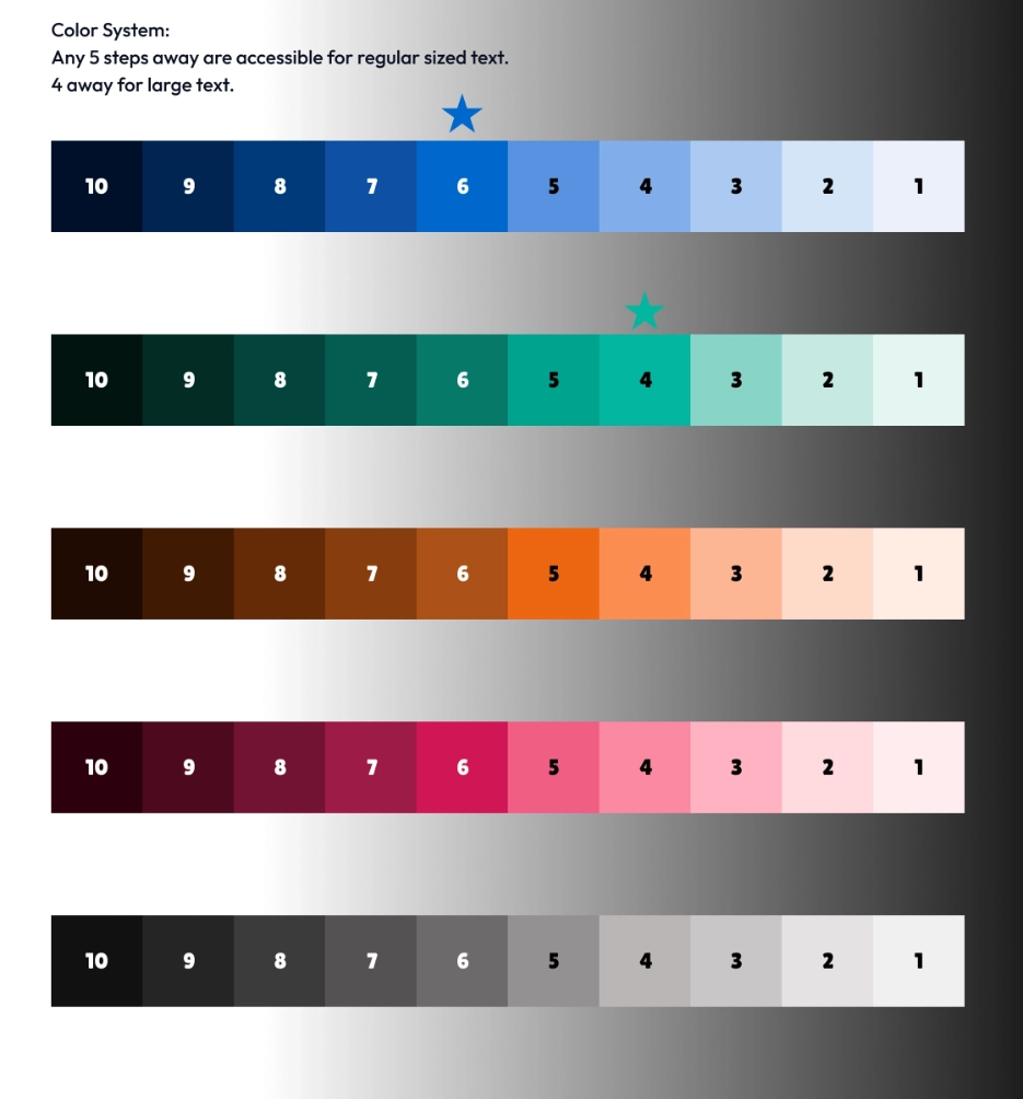
FFTM’s existing palette was bold and colorful, but would also pose a challenge to make accessible across multiple variations. The team created 10 different shades for every color, equally spaced so every color shade is replaceable with any other color at the same level. The shades were chosen carefully so that shades 5+ spaces away can be combined and will be WCAG conformant.
For typography, we chose the geometric sans-serif font called Outfit for headings and the logo, and Atkinson Hyperlegible for body text. The line length was kept to a maximum of 80 characters to ensure readability.
Design
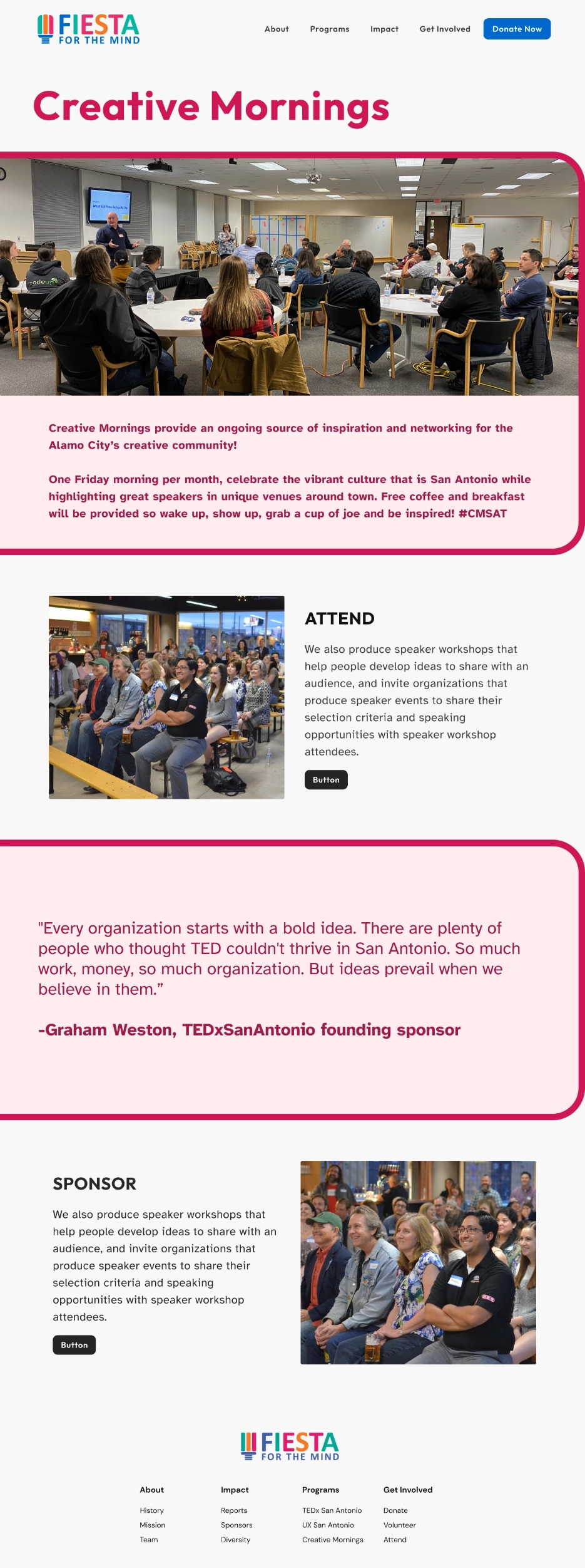
The design was inspired by the vibrant logo of Fiesta For The Mind and the Mexican Fiesta decoration, Papel Picado. This design appears as colorful containers (flags) on all pages of the site, bringing playfulness, energy, and a sense of place to the design.
Development
We kept the site build as simple as possible, fully taking advantage of the native features of WordPress, and of modern web technologies.
Utilizing modern CSS we were also able to implement fluid typography, all text content scales when the browser is resized to better utilize larger screen resolutions and keep line length comfortable. Spacing between sections also scales so there is an appropriate amount of space regardless of the viewport.
Performance
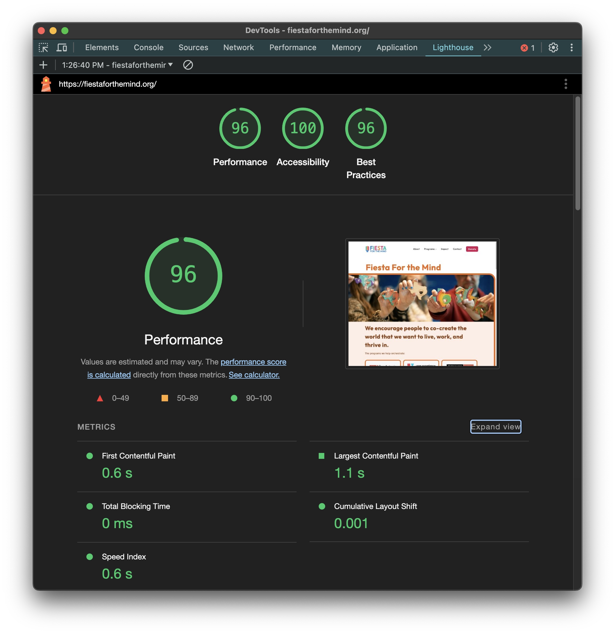
By using just a few WordPress plugins, a minimal amount of JavaScript, and embracing the cascade in CSS, the site loads consistently in about a second.
We strengthened that performance with additional measures, like compiling and minifcation, as well as image optimization.
Accessibility
We chose the plugin WS Form for the contact form, because it's well regarded in accessibility circles to be among the most accessible options available with a free tier.
We spent extra time refining the experience with small but meaningful accessibility features, for example
- External links set to open in a new tab are automatically rendered with a visual indicator as well as a content marker, so users know in advance that this will happen.
- All links, buttons, and interactive elements have a custom hover and focus style that is both on brand and highly perceivable, so users don't lose their place when navigating.
Testing & QA
Throughout design, development, and after launch, we tested the site with a variety of tools and methods to ensure it was accessible. These included browser plugins, screen readers, Figma plugins, and manual testing.
Thanks to Knowbility’s AccessWorks service, we received live testing feedback on key flows of the site. We were heartened by the positive feedback and made a few inprovements based on tester's suggestions:
- Refined the values within aria label attributes of our Team section to prevent redundancy for screen readers.
- Improved error and validation messaging on our form fields
In addition to prioritizing accessibility and aesthetics, our team maintained a strong focus on overall site quality by
- developing a comprehensive Quality Assurance (QA) rubric for testing processes.
- documented the rubric as test case templates for the client, to be used as a foundation for their QA team, enabling them to uphold and enhance the site's quality going forward.
Outcome
We were able to deliver a fully editable, performant, and accessible WordPress site that will be able to grow with their changing needs for years to come.
We also considered long term design, maintenance and QA by providing a design documentation, WordPress documentation, and test case templates.
Feel free to get in touch with me with any questions, corrections, or takedown requests.
Need help with an upcoming project?
I'd love to hear more about what you have coming up and how I can help bring it to life! My earliest availability is currently Q1 2026.
Get in Touch


