Visual History
Being a web developer, my online presence has taken several (dozen) forms, and actually a few diferent URLs. The timeline below is a brief visual history of that evolution.
-
2003
Back in 2003 when I was looking for a good URL to call home I was obsessed with a song by P.O.D. for the Matrix Reloaded soundtrack called Sleeping Awake. A couple searches and a credit card purchase later I was the proud owner of sleepingawake.net
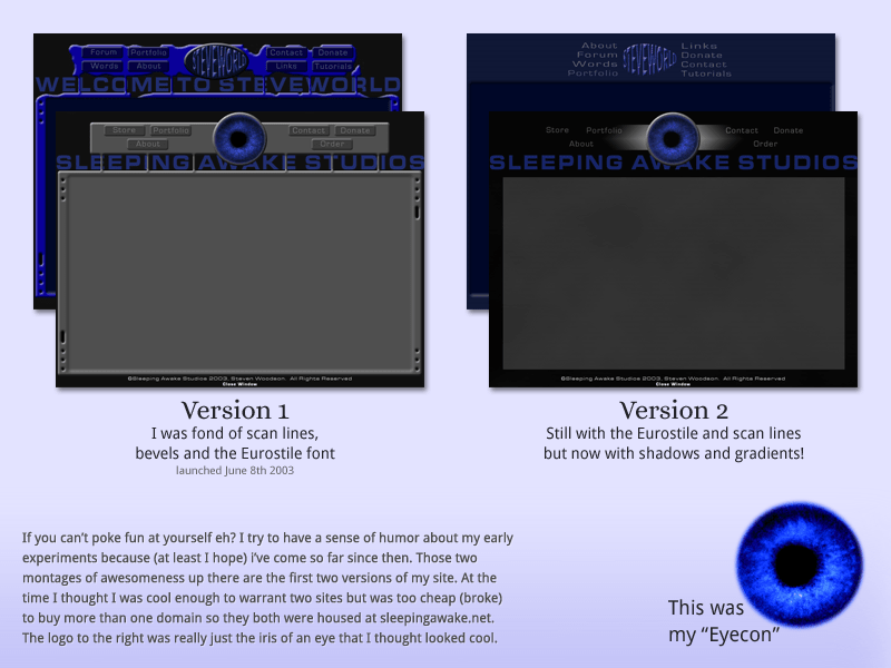
If you can't poke fun at yourself eh? I try to have a sense of humor about my early experiments because (at least I hope) I've come so far since then. At the time I thought I was cool enough to warrant two sites but was too cheap (broke) to buy more than one domain name so they both were housed at sleepingawake.net.
There are two montages in this image of what the first versions of my site looked like. The first version was full of scan lines, bevels, and the Eurostile font. The second still used Eurostile and scan lines but the bevels were replaced with shadows and gradients. The logo in the image was based on the iris of an eye that I thought looked cool, I called it my "eyecon" 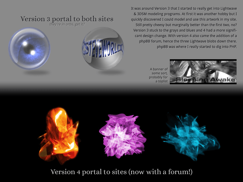
It was around version 3 that I started to really get into Lightwave and 3DSM modeling programs. At first it was another hobby but I quickly discovered I could model and use this artwork on my site. Still pretty cheesy but marginally better than the first two, no? Version 3 stuck to the greys and blues and 4 had a more significant design change. With version 4 also came the addition of a phpBB forum, hence the three lightwave blobs. phpBB was where I really started to dig into PHP.
This image shows the orb-like icons going to the two versions of my site for Version 3. Below that it shows the three abstract blobs that were links to the two versions of the site as well as the phpBB forum. 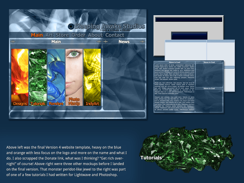
The fourth version of the studio site was heavy on the blue and orange with less focus on the logo and more on the name and what I do. I also scrapped the Donate link, what was I thinking? "Get rich overnight" of course! Bottom right of the montage shows a large green peridot-like jewel, it was one of the few tutorials I had written for Lightwave and Photoshop.
A montage image of the studio website, displaying the final design along with several iterations before that was decided. Bottom right of the montage shows a large green peridot-like jewel, it was one of the few tutorials I had written for Lightwave and Photoshop. 2004
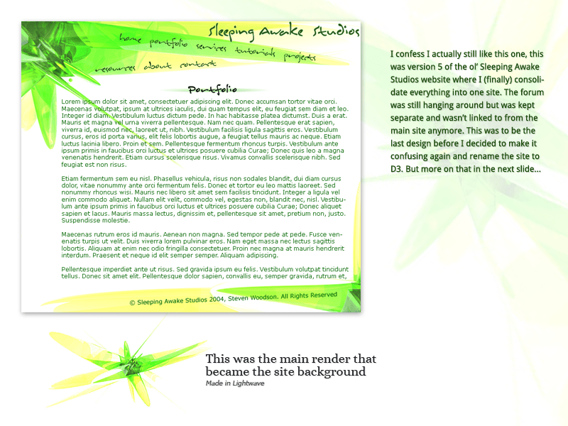
I confess I still like this one, version 5 of the Sleeping Awake Studios website where I (finally) consolidate everything into one site. The forum was still hanging around but was kept separate and wasn't linked to from the main site anymore. This was to be the last design before I decided to make it confusing again and rename the site to D3. But more on that in the next slide.
This montage shows the final design for version 5, heavy on the neon greens and yellows with an abstract shape in the background that was rendered in Lightwave. 2005
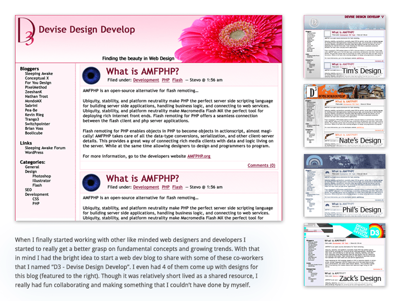
When I finally started working with other like minded web designers and developers I started to really get a better grasp on fundamental concepts and growing trends. With that in mind I had the bright idea to start a web dev blog to share with some of these co-workers that I named "D3 - Devise Design Develop". I even had 4 of them come up with designs for this blog. Though it was relatively short lived as a shared resource, I really had fun collaborating and making something that I couldn't have done by myself.
This montage shows five designs for the first iteration of the D3 website 2008
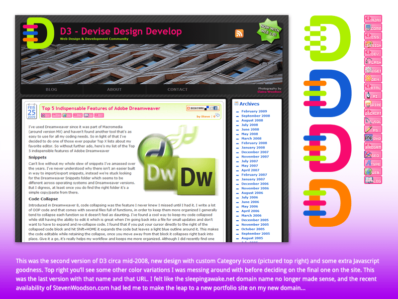
This was the second version of D3 circa mid-2008, new design with custom category icons and some extra JavaScript goodness. Top right is some color variations of the logo I was considering before deciding on the final one on the site. This was the last version with that name and URL. I felt like the sleepingawake.net domain name no longer made sense, and the recent availability of StevenWoodson.com had led me to make the leap to a new portfolio site on my new domain.
Montage showing the final design of the second version of D3, showing what a blog post would look like. There at four other concepts for the logo that explored the same shape but with differing color combinations. 2010
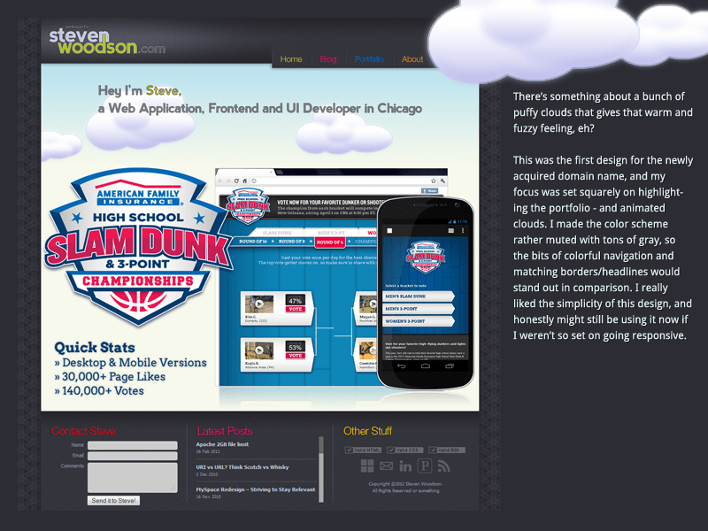
There's something about a bunch of puffy clouds that gives that warm and fuzzy feeling, eh? This was the first design for the newly acquired domain name, and my focus was set squarely on highlighting the portfolio. I made the color scheme rather muted with tons of grey, so the bits of colorful navigation and matching borders/headlines would stand out in comparison. I really liked the simplicity of this design but was set on making the next version responsive.
Montage of the final homepage design of StevenWoodson.com, shows a featured project below a set of animated clouds. 2012
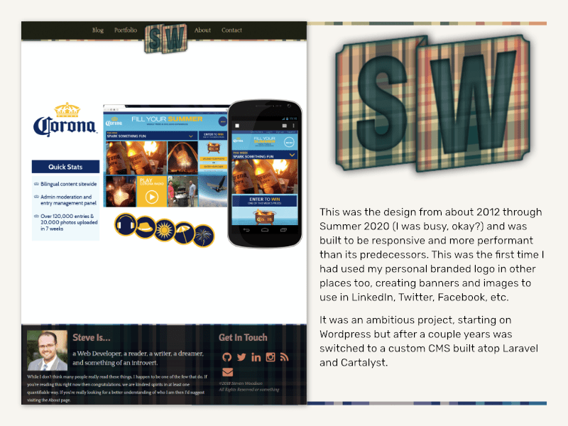
This was the design from about 2012 through Summer 2020 (I was busy, okay?) and was built to be responsive and more performant than its predecessors. This was the first time I had used my personal branded logo in other places too, creating banners and images to use in LinkedIn, Twitter, Facebook, etc. It was an ambitious project, starting on Wordpress but after a couple years was switched to a custom CMS built atop Laravel and Cartalyst.
Montage of the second final homepage design of StevenWoodson.com. It also includes a larger version of the logo with the letters S and W in green positioned over a plaid banner. 2020
StevenWoodson.com Version 2 created mid-2020, pared way down to just the essentials. All static content built with Eleventy SSG so it was blazing fast, and accessible from the start. 2023
A lot has changed over the past 20+ years since I started my digital home, trends have come and gone and I've learned - and forgot - a whole lot.
The site you're browsing now (StevenWoodson.com Version 3) was created mid-2023 and is essentially using the same content and overall structure of the 2020 version. Notable improvements are the addition of blog posts coming from a composable WordPress via API so I could draft and write better on the go. I also overhauled the styles to take advantage of modern CSS best practices like clamp, flexible typography, and well defined components.
I hope you enjoyed this trip down memory lane, and I appreciate you sticking to it through to the end!